The last and perhaps the most important part of a data analyses is to built a good visualization on the output, transforming the data acquired, cleansed and processed into rich reports, bringing valueable information for the business. Decision can be more precise, accurate and less risk if we have the right data in the right time.
There are many options in the market, for this demo we’ll learn how to use Microsoft PowerBI and create a dashboard and a report with a few clicks. If you don’t have an account yet, you can start with a free trial here.
See previous: Part 3: Using Machine Learning to calculate chance of precipitation and saving the output
Setting up a data output to PowerBI

If you followed all the previous steps, you’ll have all the necessary setup done on Microsoft Azure, with the data flowing from your device to Stream Analytics. The next steps are simple as create a new Output entry and adjust your Query.
On Stream Analytics, select your job and click on Outputs > Add. Select “Power BI” in the drop-down options.
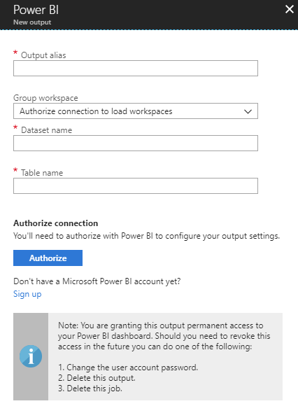
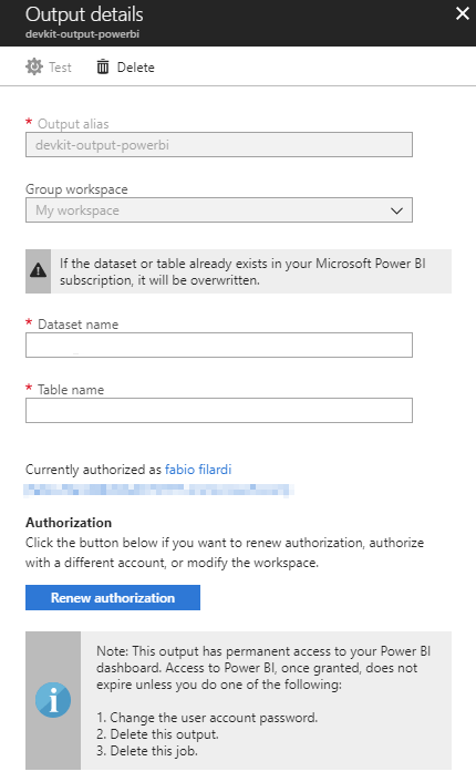
Authorize Azure to access your Power BI account clicking on “Authorize” button, then select an alias for the output, your Group Workspace, a Dataset and Table name and you’re done.
Now you need to adjust your query to output data to PowerBI. On Stream Analytics, select your job and click on Query. Insert the following query at the end of your existing:
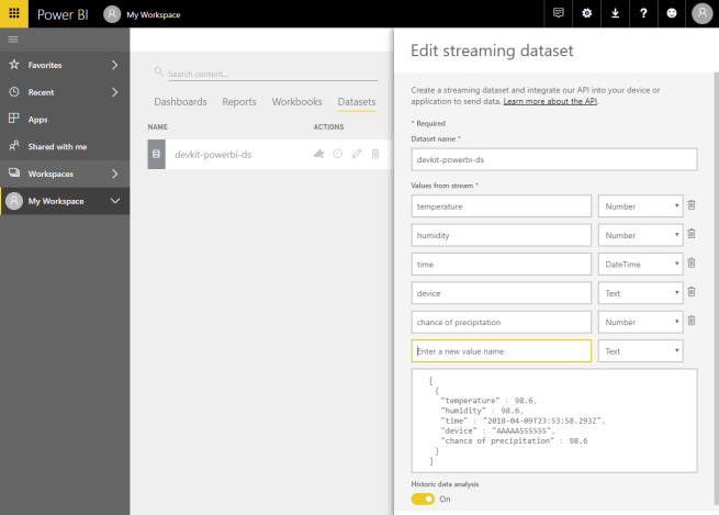
SELECT
  DeviceId AS Device,
  System.Timestamp AS Time,
  CAST (result.[temperature] AS FLOAT) AS temperature,
  CAST (result.[humidity] AS FLOAT) AS humidity,
  CAST (result.[Scored Probabilities] AS FLOAT) * 100 AS 'Chance of Precipitation'
INTO [your-powerbi-output-alias]
FROM DevKitMachineLearning
Save the query and start your Stream Analytics job. Your data is now being output to PowerBI and a dataset is automatically created based on your query. It’s ready to be used on your reports/dashboards.
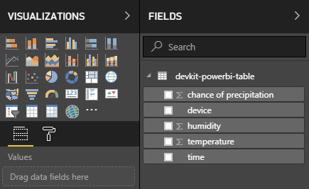
Using the design tools you can create reports adding multiple visualization types (charts, tables, KPIs and many others) based on the dataset fields.
The result is a report reflecting your real-time data.
For a complete step-by-step, check the article “Visualize real-time sensor data from Azure IoT Hub using Power BI“.

3 thoughts on “Part 4: Using PowerBI for real-time data analysis”